 Written By:
Team Contify
Written By:
Team Contify

Overview
At Contify, we are dedicated to enhancing your product experience through continuous innovations.
In our latest updates, we are excited to announce the launch of our new product offering that will speed up your M&CI workflow.
We have also rolled out advanced charts and significant improvements to the dashboard, providing enhanced visualizations—creating a unified, intuitive interface that will serve as your organization’s single source of truth.
The main highlights in this edition include:
1. Introducing Contify Copilot
2. Insights: View in Tabular Format
3. Insights: Data Export in CSV Format
4. New Auto-updating Charts – Timeline, Multi-Company Benchmarking, KIQs
5. New Auto-updating Dynamic Charts for Competitors’ Business Events
6. New Chart Types on Dashboard Widgets – Bubble and Sunburst Charts
7. Access All Product Release Notes on the Platform
Introducing Contify Copilot
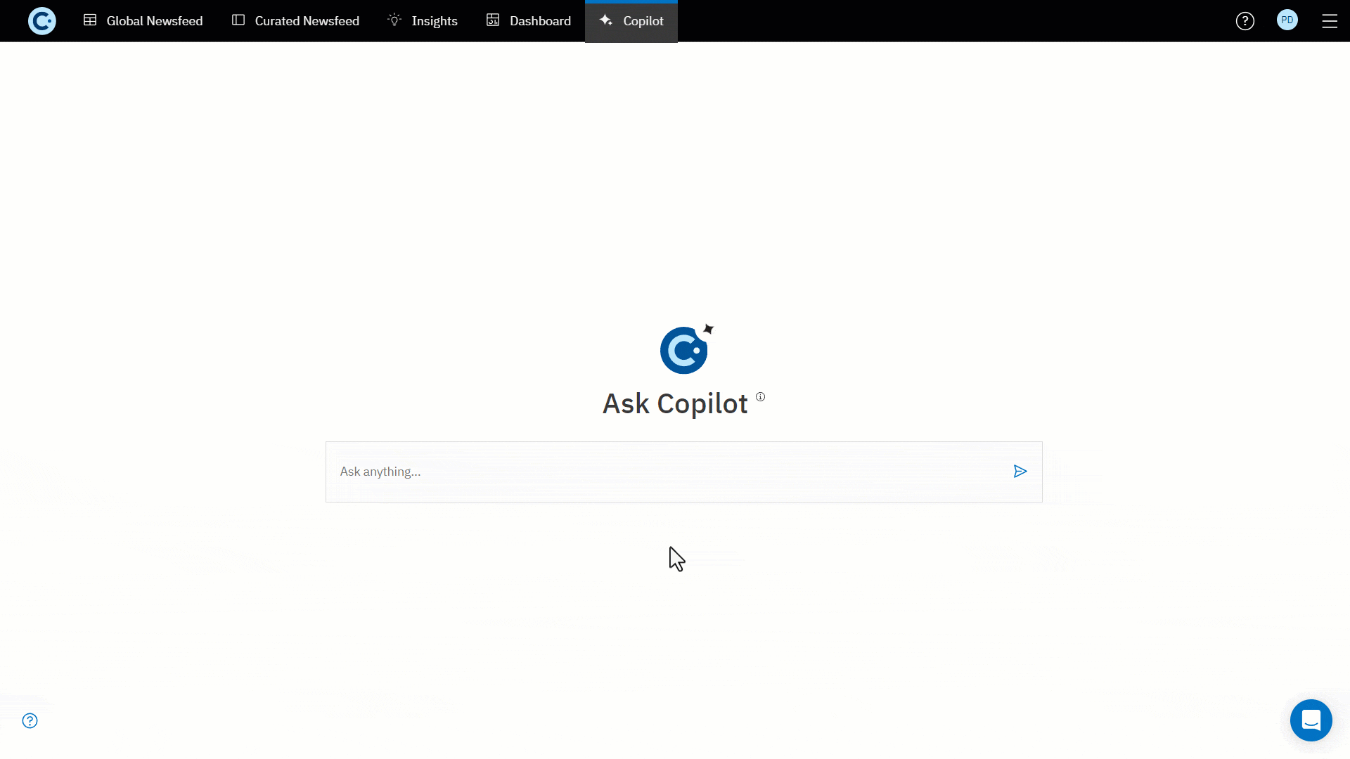
We recently introduced Contify Copilot, a conversational interface designed to provide instant, accurate answers to your ad-hoc intelligence questions, eliminating the need to sift through large volumes of information.
Unlike other AI chatbots or copilots that are heavily dependent on LLMs, Contify Copilot leverages the Insights’ Knowledge Graph and uses the RAG (Retrieval-Augmented Generation) technique to generate answers from reliable information, ensuring accuracy, precision, and trust.
Copilot analyzes all curated insights, retrieves relevant contextual data from the Insights Knowledge Graph based on the query, combines it with additional context, and then generates an informed response along with the sources from where the answer is derived.
You can leverage its capabilities to answer important questions such as:
• What are the current partnership strategies used by ____?
• What are the recent actions taken by ____ to accelerate growth?
• What new product features or services has ____ introduced?
With this addition to the Contify M&CI Platform, you can now align your intelligence efforts with your stakeholders’ strategic objectives by instantly retrieving accurate and actionable responses to their ad-hoc queries.
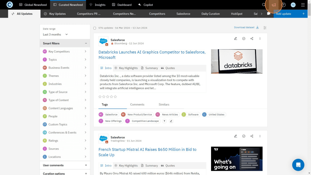
Insights: View in Tabular Format
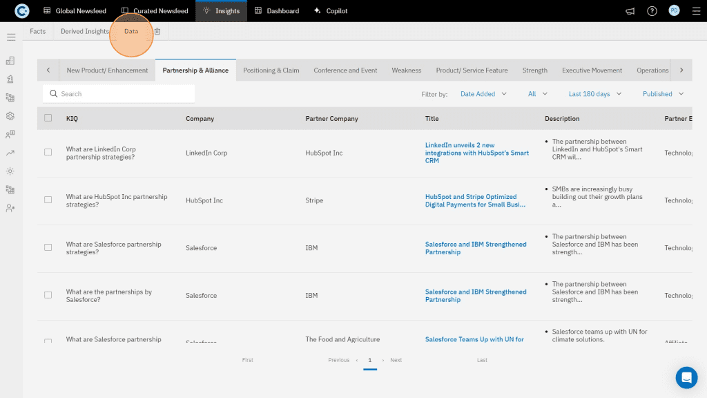
We have added a new view to the Insights module that lets you view Insights’ data in a tabular format. This structured, table-based view allows you to access, manage, and edit your insights data more efficiently.
Insights: Data Export in CSV Format
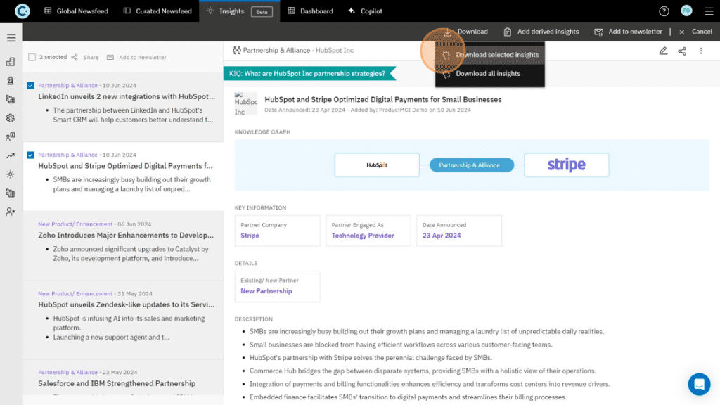
We’ve added new functionality that allows Contify Insights data to be exported as CSV files, making data sharing with teams easy and enhancing analysis.
You can export all fields from your selected insights as CSV files. The exported data can be used for detailed analysis, reporting, and presentations, adapting to various use cases.
New Auto-updating Charts - Timeline, Multi-Company Benchmarking, KIQs
We’ve added new auto-updating widgets on Contify’s dashboards to help you create effective reports and visualize your competitive landscape.
Timeline Widgets
Generate auto-updating charts to visualize complex data and present them as timeline widgets. These timelines will simplify understanding your competitive landscape by providing information in a structured and chronological format.
You can create widgets for significant business events such as partnerships, new product launches, funding rounds, and more.
Multi-Company Benchmarking
Use the new benchmarking widgets to compare your product features and offerings against competitors. This widget will help you visualize how you stack up against your industry peers, identify areas for improvement, and strategically develop a successful product roadmap to maintain a competitive edge.
Key Intelligence Questions (KIQs) Based Widgets
Use the new KIQ-based widgets to present subjective insights related to specific Key Intelligence Questions (KIQs) and access the output in a visually appealing, customizable dashboard widget.
These KIQ-based widgets update in real time whenever you add a new insight associated with a particular KIQ, making it easy to view the information that matters most to you.
New Auto-updating Dynamic Charts for Competitors’ Business Events
We’ve introduced auto-updating dynamic column charts on Contify, called Insights Cluster, to enhance the visualization and utilization of quantitative data retrieved from various competitor business events.
These charts will provide a clear visualization of essential business metrics covered in insights related to Funding, Financial performance, Capital Expenditure, Hiring, Layoffs, and more.
New Sunburst Chart Type Added on Dashboard Widgets
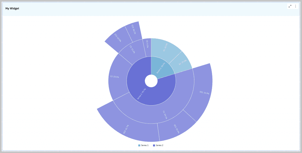
The Sunburst Chart displays multiple data points, making evaluating their relationships easier. This addition allows you to better visualize hierarchical data structures, such as organizational hierarchies, revenue breakdown by product lines, and more.
Access All Product Release Notes on the Platform
We’ve added a link on the platform header where you can easily access our recent and past product release notes.
As we continuously work hard to enhance our product and provide you with an amazing user experience, this functionality will allow you to stay informed about our new features, improvements, and fixes, ensuring you’re always leveraging the full potential of the Contify platform.
Ready to see Contify’s updated capabilities in action?
Try out our 7-day free trial. for a hands-on experience of our latest features.
That’s all for now. Stay tuned for more updates.


